Tuesday, July 28, 2026
All Geared Up to Celebrate
Monday, July 27, 2026
Dreams Come True with L'Encre et l Image
Happy Monday, friends!
It’s Walter on the blog with you today and the theme this week is
Anything Goes. My mind immediately
turned to another my favorite brands, L’ENCRE at l image, and one of their
recent releases, Arsene my Sweetheart.
This character is adorable and so versatile – he can be royalty, a
clown, a magician, or just a simple boy like I portrayed him this week. I paired him with elements from another
L’ENCRE product, Imminent Departure, to create a wonderful, inspirational card.
I began by deciding on the placement of my paper airplane,
boy, and paper boat. I then stamped
those images onto an A2 sized piece of watercolor paper and then stamped them
again onto masking paper. I created masks
to protect my images and make it easier to watercolor the background. Once the masks were fussy cut, I covered my
images and got ready to color the panel.
I used colors from Lindy’s Magicals Nantucket Pearls (Whale Watch Blue & Salt Water Taffy) to watercolor a blended evening sky. The Lindy’s Magicals blend so easily, and the bits of mica give such an amazing shimmer. I started by misting my panel and then sprinkling a little bit of Whale Watch Blue at the top of it. I used a paint brush to move the color around while spraying with additional mists of water as needed to move & lighten the color. I continued adding blue and then started to mix in a little Salt Water Taffy about 2/3 of the way down the panel before switching to just the pink to finish it off.
Once dry, I stamped the compass image behind the paper
airplane and my sentiment with clear embossing ink. I sprinkled silver embossing powder over the
compass and removed the mask. I then
sprinkled white embossing powder over the sentiment and heat set both images.
I was now ready to add color to my stamped images. I removed the remaining masks and started coloring them with alcohol markers. I used two light shades of cool gray color the paper airplane and boat. I chose colors for the rest of the boy image that would allow me to use just a few to not overwhelm the scene. I have a tip for you for coloring hair – especially curly hair – that a friend passed along to me. I began by uniformly coloring his hair with a darker shade of brown. I then used the fine tip end of a lighter brown to add little dots to lighten up portions of the darker brown. The final step was to use a darker shade of orange and add more dots. Coloring hair this way gives it the illusion of texture and highlights that make it more interesting than just one color.
I finished off the scene using a silver metallic marker to
add varying sizes of dots in the sky to represent stars and then adding three
Hunky Dory Diamond Sparkles Silver Pearls.
This scene is so charming and cute!
The sentiment, which translates to “I want my dreams to come true,” is
so fitting and is certain to inspire and encourage someone.
I hope that you enjoyed this creation and post. I’ll see you here again next week. Until then . . . be well!
Friday, July 24, 2026
Bright, Bold & Beautiful: A Mixed Media Floral Card
Hello Topflight friends! Ericka from Strangely Creative here, and today I'm sharing a bright, colorful card that combines some of my favorite things: gel printing, embossing powder, texture, and lots of sparkle!
One of the things I love most about mixed media is discovering new ways to use the supplies already sitting on my craft desk. This project not only added beautiful shimmer to a gel print, but it also gave new purpose to a well-loved embossing pad that was almost ready for retirement.
🎨 Starting with a Colorful Gel Print
Every great mixed media project starts with an interesting background, and for this card I chose one of my vibrant gel press prints.
It already had plenty of color, but I wanted to add another layer of texture that would catch the light and make the background feel even more dynamic.
✨ Adding Texture & Sparkle
To create that extra dimension, I reached for the PaperArtsy Tracy Scott PS519 stencil and my trusty WOW! Embossing Pad.
If you're trying this technique, the safest way to apply embossing ink through a stencil is with an ink blending sponge or dauber. It helps protect your embossing pad while giving you great control over the design.
But here's where this project took a slightly different turn...
I have an old WOW! embossing pad that's been on my craft table for well over ten years. It's definitely showing its age, but it's still just juicy enough to be useful. Rather than throwing it away, I've officially promoted it to my mixed media embossing pad!
Since it's nearing the end of its life anyway, I simply pressed it directly through the stencil before sprinkling on WOW! Blue Diamond and Cerulean embossing powders.
The result is a beautifully textured background with layers of shimmer that change as the light hits the card. Sometimes our oldest supplies still have plenty of creative life left in them.
🌸 Creating the Focal Point
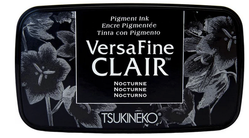
For the focal image, I stamped the beautiful PaperArtsy Tracy Scott 108 bloom onto another gel print that featured Nuvo Drops, creating a soft, sparkly texture behind the flower. Using Versafine Clair Twilight ink allowed the detailed lines of the bloom to stand out beautifully against the colorful background.
Once everything was trimmed, I layered the flower onto the embossed background and finished the card with a sentiment from the Lavinia Uplifting Collection.
💌 Finishing Touches
This card came together with just a few simple elements:
- A colorful gel print background
- Embossed texture through a stencil
- Sparkling embossing powders
- A bold floral focal image
- A simple sentiment to finish the design
It's proof that layering color, texture, and shine can create plenty of impact without adding lots of embellishments.
Thank you so much for stopping by today! I hope this project inspires you to experiment with texture, embrace a little sparkle, and find new ways to enjoy the supplies you already own.
Have a wonderful weekend, and happy creating! ✨💙🌸
Topflight Stamp Supplies
![]() PaperArtsy - Tracy Scott 108 Shop at: TP |
![]() PaperArtsy - Tracy Scott PS519 Shop at: TP |
![]() WOW! Embossing - Clear Embossing Pad Shop at: TP |
![]() WOW! Embossing - Tracy Scott Pea Coat Shop at: TP |
![]() Lavinia - Sentiment Stickers - Uplifting Collection Shop at: TP |
![]() Tsukineko - Versafine Clair - Twilight Shop at: TP |
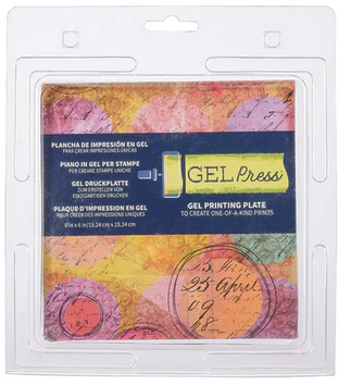
![]() Gel Press - Reusable Gel Printing Plate Shop at: TP |
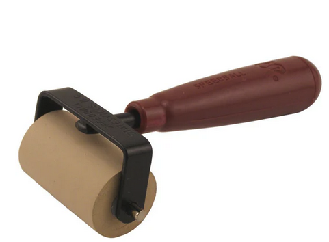
![]() Speedball - 2" Brayer Shop at: TP |
Wednesday, July 22, 2026
Brand Focus on PaperArtsy!
Hello, Lisa Hoel here. This week at Topflight Stamps our brand focus is on PaperArtsy. I have to admit, PaperArtsy is one of my favorite brands! I appreciate that they have such a variety of styles showcased by their different designers. For this card, I chose stamps and a stencil from Mags Woodcock.
Topflight Stamps Supplies Used:
Tuesday, July 21, 2026
Attitude is...
Monday, July 20, 2026
A Funny Little Romance
Hey there, friends! It's another Monday and another post with Walter. This week's theme is PaperArtsy and I was so torn between a serious card or one with lots of whimsy since they offer so much of both. Ultimately, something fun and whimsical won out - but I did throw in a touch of some serious elements. I fell in love with these Zinis characters as soon as I saw them on the Topflight Stamps website - they're just so cute and fun. The way that the little guy looks so adoringly off to the side while the little woman throws her hands up in the air (waving them like she just don't care!) looked to me like two people in love. That's exactly what my design this week celebrates . . . a funny little romance.