Hello Topflight friends! Ericka from Strangely Creative here, and today I'm sharing a bright, colorful card that combines some of my favorite things: gel printing, embossing powder, texture, and lots of sparkle!
One of the things I love most about mixed media is discovering new ways to use the supplies already sitting on my craft desk. This project not only added beautiful shimmer to a gel print, but it also gave new purpose to a well-loved embossing pad that was almost ready for retirement.
🎨 Starting with a Colorful Gel Print
Every great mixed media project starts with an interesting background, and for this card I chose one of my vibrant gel press prints.
It already had plenty of color, but I wanted to add another layer of texture that would catch the light and make the background feel even more dynamic.
✨ Adding Texture & Sparkle
To create that extra dimension, I reached for the PaperArtsy Tracy Scott PS519 stencil and my trusty WOW! Embossing Pad.
If you're trying this technique, the safest way to apply embossing ink through a stencil is with an ink blending sponge or dauber. It helps protect your embossing pad while giving you great control over the design.
But here's where this project took a slightly different turn...
I have an old WOW! embossing pad that's been on my craft table for well over ten years. It's definitely showing its age, but it's still just juicy enough to be useful. Rather than throwing it away, I've officially promoted it to my mixed media embossing pad!
Since it's nearing the end of its life anyway, I simply pressed it directly through the stencil before sprinkling on WOW! Blue Diamond and Cerulean embossing powders.
The result is a beautifully textured background with layers of shimmer that change as the light hits the card. Sometimes our oldest supplies still have plenty of creative life left in them.
🌸 Creating the Focal Point
For the focal image, I stamped the beautiful PaperArtsy Tracy Scott 108 bloom onto another gel print that featured Nuvo Drops, creating a soft, sparkly texture behind the flower. Using Versafine Clair Twilight ink allowed the detailed lines of the bloom to stand out beautifully against the colorful background.
Once everything was trimmed, I layered the flower onto the embossed background and finished the card with a sentiment from the Lavinia Uplifting Collection.
💌 Finishing Touches
This card came together with just a few simple elements:
-
A colorful gel print background
-
Embossed texture through a stencil
-
Sparkling embossing powders
-
A bold floral focal image
-
A simple sentiment to finish the design
It's proof that layering color, texture, and shine can create plenty of impact without adding lots of embellishments.
Thank you so much for stopping by today! I hope this project inspires you to experiment with texture, embrace a little sparkle, and find new ways to enjoy the supplies you already own.
Have a wonderful weekend, and happy creating! ✨💙🌸
Topflight Stamp Supplies
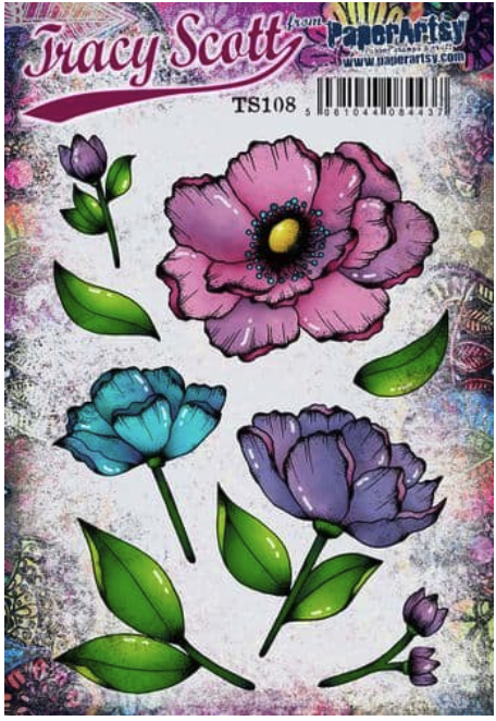
PaperArtsy - Tracy Scott 108
Shop at:
TP |

PaperArtsy - Tracy Scott PS519
Shop at:
TP |
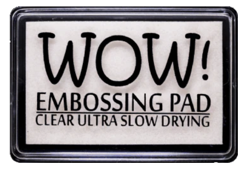
WOW! Embossing - Clear Embossing Pad
Shop at:
TP |
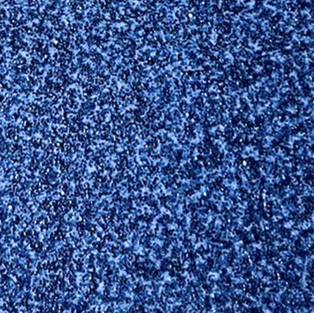
WOW! Embossing - Tracy Scott Pea Coat
Shop at:
TP |
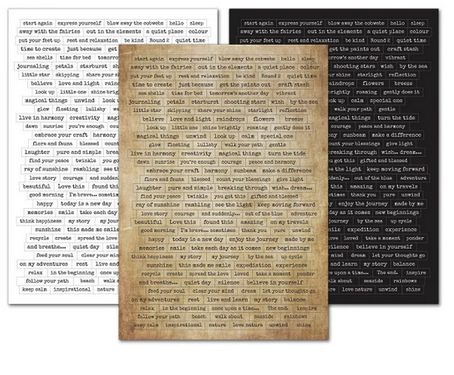
Lavinia - Sentiment Stickers - Uplifting Collection
Shop at:
TP |
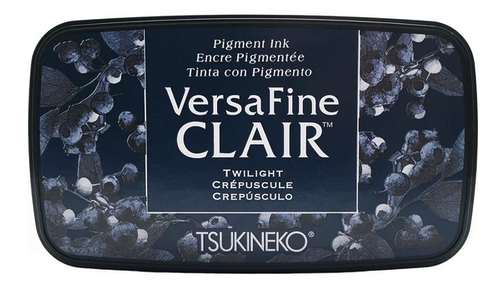
Tsukineko - Versafine Clair - Twilight
Shop at:
TP |
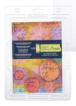
Gel Press - Reusable Gel Printing Plate
Shop at:
TP |
Speedball - 2" Brayer
Shop at:
TP |