Showing posts with label stamping. Show all posts

Monday, September 14, 2026

Autumn Dreaming with Chou & Flowers

Hi, friends!  It's another Monday with Walter on the blog.  We're moving into my favorite time of the year - autumn.  I know that a lot of people don't want to rush the last few weeks of summer but I'm ready for some much cooler nights & mornings, beautiful colors, and the wonderful smells.  That's what inspired my design for this week . . . dreams of autumn!  I used two gorgeous stamp sets from the Chou & Flowers My Little Garden release to create it: Bird Cage and Artist Garden.


My thought was to have artist canvas and easel from Artist Garden be the vessel that displays the main image.  I started by stamping them onto a 4"x5.25" white cardstock panel.  I then took the woman on a swing stamp from Bird Cage and stamped it onto the center of the canvas.  With that done, I started to color the image of the woman.  I used a combination of markers from my stash to add both the main color and details.


I then used a light yellow gray alcohol marker to add a plain color around the edges of the canvas - using flicks of the brush tip to make uneven marks around it.  I then used light shades of red, orange, and yellow to blend a sunset around the woman.


I decided to add some leaves from the Artist Garden set on each side of the swing, stamped them with Rusty Hinge Distress Ink, and added some red highlights to the leaves with an alcohol marker.  A small brush and Pumice Stone Distress Oxide ink add a light gray/brown hue around the outside of the canvas.  I lightly spayed the whole stamped panel with water, let it dry, and then lightly sprayed it with rubbing alcohol to help fade the image a bit and make it look more dreamlike.

The final steps were to create the sentiment strip and faux washi tape strips that I used to embellish the card.  For the sentiment strip, I ink smooshed a strip of white cardstock into a mixture of Rusty Hinge Distress Ink & water and dried it.  I then stamped the word Dream from Bird Cage with Vintage Photo Distress ink.  I stamped two pieces of the faux washi tape with Rusty Hinge Distress Ink, colored them with markers, and fussy cut them.  The sentiment and embellishments were then added to the card.


An overall simple card to create and one which could easily be switched to a spring or summer theme.  It would be fun to do that and have the same design, with different color schemes for those seasons, to send to someone special over the course of the year!

Thanks for spending this time on the blog with me today.  I'll see you here again next week.  Until then . . . be well!

Topflight Products Used:


Monday, August 24, 2026

Notes of Love with PaperArtsy

Hi, friends!  Welcome back to the blog.  It's Walter with you today as I kick off a new week's theme, which is . . . anything goes.  I really enjoy the designs of Mags Woodcock.  I first came across her work in Somerset Studio magazine and was so excited to see her products with PaperArtsy on the Top Flight Stamp website.  This week, I used two of her coordinating products, PaperArtsy - Mags Woodcock - EMW004 - Rubber Cling Mounted Stamp Set and PaperArtsy - Stencil - Mags Woodcock - PS517 to create my card.  Let's jump into my process!


I began with an A2 sized piece of watercolor paper that I spritzed with water. Instead of painting with watercolors, I decided to paint with Distress Oxide Ink smooshed on my craft surface and mixed with water.  Using the oxide inks mixed with water gives an opaque, almost paint-like look.  I used a mop brush to first move Tattered Rose around the inside of the paper and then Antique Linen around the edges.


Once dry, I stamped the heart stamp onto the panel using Versafine Fallen Leaves ink.  I also stamped the large heart and small heart onto masking paper and set that aside.  I then stamped the image of the word Love repeated several times using Ground Espresso Distress ink.


I fussy cut each of the heart masks from the masking paper and applied them to the images.  I wanted the brown color of the stenciling to be lighter than the dark shade of Fallen Leaves so I used Ground Espresso Distress Ink to add that contrast.


I removed the masks and added spots of a varying pink color to the hearts and did that with a mixture of Spun Sugar Distress Oxide ink and water.  I then tapped the entire panel with a brush loaded with Tea Dye Distress ink to some vintage grunge.  Some subtle shine was added to the panel using the ovals on the stencil and Delicata Golden Glitz ink.  I also added some splatter using Old Paper Distress Spray Ink.  In order to add further age to the panel, I used a plastic knife to distress the edges and then ran Ground Espresso Distress ink around them.

Some kind of a floral element was needed to truly complete the design.  I stamped three of the small flowers, colored them with alcohol markers, Accented the petals with a gold gel pen, added grunge with Tea Dye Distress ink, and fussy cut them.  They were adhered with double-sided foam tape and embellished with acrylic drops that I colored gold using a Studio Light Gold Metallic Martker.


I'm really happy with this design.  With elements of love, nature, and music . . . it truly strikes the right note!  Thanks for spending some time with me on the blog today.  I'll see you again next week.  Until then . . . be well!

Top Flight Stamps Products Used:


Monday, August 17, 2026

Vacation! with Chou & Flowers

Happy Monday, friends!  It's Walter on the blog with you today and this week's theme is the outdoors.  We're now in the last weeks of summer and I thought it was fitting to use this theme to offer the last of the beach scenes for the year.  I used some beautiful stamp sets from Chou & Flowers to create the scene.  It's an overall simple card created with just stamping, a little fussy cutting, and a lot of coloring.


I began by stamping my A2 background panel using the Summer Souvenirs - Beach Huts stamp set and Versafine Clair Nocturne ink.  The row of beach huts fits perfectly onto the panel to provide a perfect beach background.  I then took the sand detail stamp from the View of Paradise stamp set and repeat stamped it around the sand area of the scene using a medium brown ink.


I colored my panel starting with the sand.  I use Ohuhu alcohol markers as I find they blend nicely and are cost-effective alternative vs. other brands.  I used a darker tan color called Khaki to go around the edges and then used a lighter tan color called Sand to fill in and blend it all together.  I then used several shades warm gray, neutral gray, blue, and red to finish the scene.  I went over the areas that I left white with a white gel pen to add some texture and make them pop.

I then stamped my beach umbrella, beach chair, and beach accessories using stamps from the View of Paradise stamp set using Versafine Clair Nocturne ink.


I colored the images and then fussy cut them.  I adhered the beach accessories directly to the sand area with glue and the umbrella & chair with some double-sided foam tape.  Voila . . . a finished card to celebrate vacation!  As I previously said, it's a very simple card.  Sometimes it's fun to stick to the basics on just focus on scene rather than trying to incorporate lots of different techniques.  I love the vibrancy of the colors and all of the little details that tie it all together.


I hope that you enjoy this card!  Are you sad to see summer coming to an end or are you happy that fall is right around the corner?  Let me know in the comments below!  I'll see you again next week for some more creative fun.  Until then . . . be well!

Monday, July 27, 2026

Dreams Come True with L'Encre et l Image

Happy Monday, friends!  It’s Walter on the blog with you today and the theme this week is Anything Goes.  My mind immediately turned to another my favorite brands, L’ENCRE at l image, and one of their recent releases, Arsene my Sweetheart.  This character is adorable and so versatile – he can be royalty, a clown, a magician, or just a simple boy like I portrayed him this week.  I paired him with elements from another L’ENCRE product, Imminent Departure, to create a wonderful, inspirational card.


I began by deciding on the placement of my paper airplane, boy, and paper boat.  I then stamped those images onto an A2 sized piece of watercolor paper and then stamped them again onto masking paper.  I created masks to protect my images and make it easier to watercolor the background.  Once the masks were fussy cut, I covered my images and got ready to color the panel.


I used colors from Lindy’s Magicals Nantucket Pearls (Whale Watch Blue & Salt Water Taffy) to watercolor a blended evening sky.  The Lindy’s Magicals blend so easily, and the bits of mica give such an amazing shimmer.  I started by misting my panel and then sprinkling a little bit of Whale Watch Blue at the top of it.  I used a paint brush to move the color around while spraying with additional mists of water as needed to move & lighten the color.  I continued adding blue and then started to mix in a little Salt Water Taffy about 2/3 of the way down the panel before switching to just the pink to finish it off.


Once dry, I stamped the compass image behind the paper airplane and my sentiment with clear embossing ink.  I sprinkled silver embossing powder over the compass and removed the mask.  I then sprinkled white embossing powder over the sentiment and heat set both images.


I was now ready to add color to my stamped images.  I removed the remaining masks and started coloring them with alcohol markers.  I used two light shades of cool gray color the paper airplane and boat.  I chose colors for the rest of the boy image that would allow me to use just a few to not overwhelm the scene.  I have a tip for you for coloring hair – especially curly hair – that a friend passed along to me.  I began by uniformly coloring his hair with a darker shade of brown.  I then used the fine tip end of a lighter brown to add little dots to lighten up portions of the darker brown.  The final step was to use a darker shade of orange and add more dots.  Coloring hair this way gives it the illusion of texture and highlights that make it more interesting than just one color.

I finished off the scene using a silver metallic marker to add varying sizes of dots in the sky to represent stars and then adding three Hunky Dory Diamond Sparkles Silver Pearls.  This scene is so charming and cute!  The sentiment, which translates to “I want my dreams to come true,” is so fitting and is certain to inspire and encourage someone.

I hope that you enjoyed this creation and post.  I’ll see you here again next week.  Until then . . . be well!

Topflight Products Used:

Thursday, February 19, 2026

Flower Press Art Collection

Hello!  This is an Anything Goes week at Topflight Stamps, and I am sharing a neutral colored card featuring Flower Press by AALL & Create again!  On January 22nd, I used this same pretty stamp in a paper-pieced fashion.  For today's card, I went with a sort of clean and simple look.  On a piece of packaging I was hanging on to, I stamped the image with Versafine Onyx Black ink.  I inked the edges of the panel with Lavinia Truffle Dye Ink, a rich brown.  The panel was glued onto a kraft background card base.  My little ephemera piece is a nest image from PaperArtsy Apple Blossom Edition by Alison Bomber, stamped in the Versafine Onyx Black, trimmed, and touched up around the edges with the Lavinia Truffle Ink.  I used dimensional tape to adhere it onto the card, and underlined it with some floral embroidery trim from my stash.  Hope you have a beautiful day! ~ Colleen


Supplies from Topflight Stamps:


Monday, January 20, 2025

Joyful Robins

Hello!  Colleen Dietrich here to share with you a card as we highlight AALL & Create products this week!   I used the ATC Festive die set for my sentiment.  It looks pretty with a subtle silver glitter paper, and lives up to the 'festive' name!  I also used the Crafty Individuals - Jolly Holly Robins to coordinate with the 'joy' die cut.  Those little birds are singing amidst holly branches... definitely a joyful scene!  These were mounted on a panel of deep red patterned paper, to make both the image and the die cut pop.

Be sure to check out all of the AALL & Create items in the Topflight Stamps store.  So, so many AALL options - over 1,000 items!


Items used from the Topflight Stamps store:


Sunday, December 18, 2022

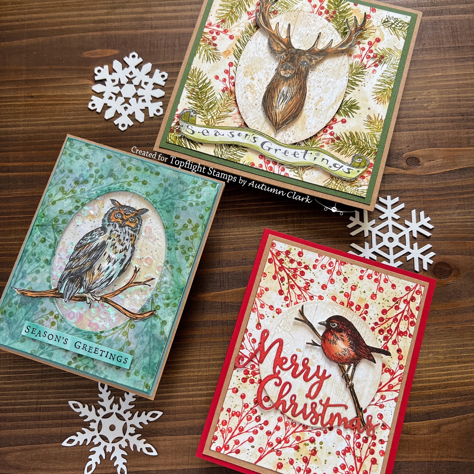
Katzelkraft Masculine Woodland Christmas Cards


Hi friends!  It's Autumn from SewPaperPaint with you to share some Christmas card inspiration featuring gorgeous Katzelkraft stamps.

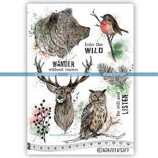
For my first card I really wanted to create a manly Christmas card and fell absolutely in love with the Into the Wild stamp set deer.  I watercolored and fussy cut him and mounted him onto a woodgrain oval panel.  I created the background by repeat stamping onto another inky panel.  

I finished with a long sentiment wood stamp from my stash by Penny Black.  

I was trying to take turns using each of the woodland critters in the stamp set, so I picked the darling bird on a branch image next.  

I followed the same process and used the berry stamp for the background this time.  Every single stamp in this set is very useful!

Finally, I managed one more card with the owl.  (Poor bear...)  I decided to make a shaker this time and used muted neutral colors.  

This stamp set was not specifically designed to be a Christmas set, but I hope these cards give you some new ideas and you will take some time to play.  xx, Autumn

01 09 10